Spatial Modeling with isee Spatial Map
Editor’s Note: This is part 3 of a 3-part series on spatial modeling in iThink and STELLA. Part 1 is available here. Part 2 is available here.
Last time, we explored a two dimensional diffusion problem by looking at a metal plate with constant heat applied to the center. The model is available here: 2d-diffusion. The results, using isee Spatial Map, of the start (left) and end (right) of a six-minute simulation are shown below.
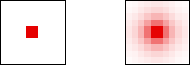
I am frequently asked how to set up Spatial Map. isee Spatial Map is a simple program that can be used to display any dataset as a two dimensional grid with specific colors assigned to data ranges. Since it is stand-alone, iThink and STELLA communicate with it through the Export Data functionality. If you wish to plot simulation results in Spatial Map, you must first set up a persistent link to a CSV file. This persistent link is always going to be from a table that contains just one element of the array you wish to view in Spatial Map.
In this example, a table named “Temp Export Table” was created to export the temperature data. The first element, temperature[1, 1], was placed in the table. There is a subtlety here that cannot be overlooked. I wish to plot the values of the stock T as it varies over time. Yet I export a different variable named “temperature”. Why is this?
This is necessary because although stocks can be exported in the format Spatial Map expects, the export settings that are compatible with Spatial Map only export their initial values no matter where the simulation is. If we export T, we will only ever see the initial conditions in Spatial Map. Thus, when displaying a stock in Spatial Map, and we almost always do display stocks, it is necessary to create a converter that is set identically equal to the stock. The converter will export its current values, and since it is equal to the stock, the stock’s current values will be exported. The converter used for this purpose in this sample model is named “temperature”.
Next it is necessary to set up the persistent link. Choose Export Data… from the Edit menu. The Export Type should already be set to Persistent and Dynamic. Under Export Data Source, select “Export variables in table” and choose the table with the array element in it from the pop-up menu. In this case, that table is called “Temp Export Table”. Also select “One set of values” under Interval. This forces the data to be export in the format required by Spatial Map. These settings are shown below.
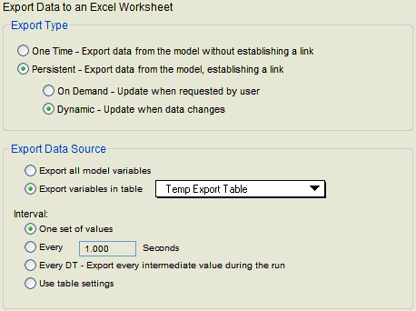
To finish setting up the export, choose the CSV file to export to and press OK. For this model, the file is named “2D Diffusion.csv”. Note that all of this has already been set up in the attached sample, so you will not be able to set it up again. You can examine the settings, though, by choosing Manage Persistent Links in the Edit menu and then pressing the Edit link at the end of the “Temp Export Data” line in the Export block.
The value of “temperature” will now be exported once at the start of each run and once at the end. If you wish to see the simulation unfold in Spatial Map, it will be necessary to set a Pause interval, as dynamic links are also exported every time the simulation pauses. Under Runs Specs… in the Run menu, you can see that I have set the Pause Interval to 20. This forces the Spatial Map to update every 20 seconds during the simulation run. This also forces the user to keep pressing Run to advance the simulation.
Finally, it is necessary to set up Spatial Map. Launch isee Spatial Map from the iThink or STELLA installation [in the Start menu on Windows, or in the iThink/STELLA folder in Application on the Macintosh]. Press the “Set CSV” button and choose the CSV file that is the target of the export. For this example, the file is named “2D Diffusion.csv”. An empty grid with the same dimensions as the exported array should appear. In this case, the temperature array is 10 by 10. Press the Settings button in the upper left corner. Its icon is three intermeshed gears. This dialog is where most of the magic of Spatial Map occurs. Please refer to Part 3 of the Technical Documentation (www.iseesystems.com/Help) for a full description of how to use this dialog.
At this point, it is important to take a moment to plan what you hope to see. The temperature values on this plate vary from 0 to 100 degrees. It would be ideal if the temperature on the plate was displayed white at zero degrees, red at 100 degrees, and a graduated blend from white to red for values in-between.
Spatial Map allows colors to be assigned to ranges of variables. Blends have been added on top of this interface, making the setting up of blends a little tricky.
The left side of the Settings dialog shows the colors assigned to the various ranges. This will be blank when you first open the dialog. To see an example, double-click the sample named “Test Configuration” on the right side. At this point, three numbers will appear on the left side with colors directly across from each value:
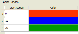
Each value corresponds to the starting value in a range. The previous range ends just below the value given as the start for the next range. For the above setup, if 0 = value < 10, the cell will be colored red. If 10 = value < 20, the cell will be colored blue. If value = 20, the cell will be colored green. Spatial Map always colors values below the lowest value given in white, so if value < 0, the cell will be colored white.
This is fairly straightforward, but does not map directly to blended colors. If values between 0 and 10 are supposed to appear in some shade of red, which value should be full red? 0? 10? 5? If values between 10 and 20 are supposed to appear in some shade of blue, which value should be the full blue that appears here? And what happens at the boundary between red and blue, i.e., at 10? If this is a perfect blend between the two colors, it would seem that values at the boundary (10) should be a 50/50 blend of the two colors red and blue. Based on this fixed point, Spatial Map applies the full color at the middle of the range and blends out to middle of the neighboring ranges. Thus, full red is at 5 and full blue is at 15 with the gradations shown below:
| 5: | __________ | red |
| 7.5: | __________ | 75% red and 25% blue |
| 10: | __________ | half red and half blue |
| 12.5: | __________ | 25% red and 75% blue |
| 15: | __________ | blue |
On the other side, the red region blends to an equal-sized white region. Therefore, cell values containing zero will be half white and half red.
This definition of blends also requires that the top color have a fully-defined range so it can be blended with its neighbor and with white beyond that limit. When you select “Blend Colors” at the bottom of the dialog, you are also asked to enter the ending value of the last range. This is really the start of the hidden white range at the top.
For this example, we want to show 0 in white and 100 in red. The simple setup below will not do this.
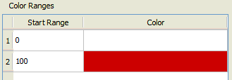
With blend colors on and the end of the last range set to 150, this setup uses white for all values less than 50 (the middle of the first range), full red at 125 (the middle of the second range), a blend from white to red between 50 and 125 (with half white and half red at 100) and a blend from red to white from 125 to 175 (with half red and half white at 150).
The desired behavior, however, is white at 0, full red at 100, and a blend from white to red in-between. We expect the color to be half white and half red at 50. This gives us three points to use to set up the proper ranges for this blended behavior:
| 0: | __________ | white |
| 50: | __________ | half white and half red |
| 100: | __________ | red |
We learned above that the half-blend point is the value we need to use for the start of the range for the second color. Thus, we will place red at 50.
We also learned that the full colors appear at the midpoint of the ranges. Thus, to get white at 0 when the next range boundary is at 50, we must go 50 back from 0 to -50. So we will place white at -50. Finally, we need to define the end of the red range. If 100 is the midpoint of a range that starts at 50, the range will end at 150. This configuration is shown below:
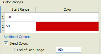
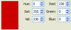
The specific red used in this example is a slightly darkened version of pure red, chosen in order to look more realistic. Click on the color on the right to open the color picker. Start by selecting pure red from the list of basic colors (fourth down in the second column). Tone down the Red (or the Val) component from 255 to 230 in the bottom right (see below) and press OK.
If you have set up Spatial Map correctly, when you run the model, you will see the temperature diffuse across the plate as the simulation progresses, with the spatial map updating each time the model pauses.