Multiobjective Optimization
This is the third of a three-part series on calibration and optimization. The first part can be accessed here. The second part can be accessed here.
Sometimes optimizing one objective does not give the best solution, for example, when judgment is needed to determine which solution between many equally optimal solutions is truly the best, given the tradeoffs between them. While it is possible to approximate the tradeoffs by assigning different weights to each objective in a single-objective optimization, it is quite likely this will not find the best solution for your situation. In these cases, it is best to use multiobjective optimization, i.e., optimize for multiple objectives at the same time.
But what does that mean in practice? While I can find the optimal value of each objective, what does it mean to optimize all of them simultaneously? It certainly isn’t true that they will all be at their individual optimums when all are optimized. In fact, when we perform multiobjective optimization, we find a set of solutions that are all optimal according to the following definition of non-dominated:
A solution that outperforms another solution in at least one objective is non-dominated by the other solution.
The set of non-dominated solutions in the population are called the non-dominated front. A non-dominated front (Pareto rank 1) for a minimization problem is shown in the figure below. Note there are also two dominated fronts in the set of solutions (Pareto ranks 2 and 3). The characteristic convex shape clearly shows the tradeoffs between the two objectives with the best compromise landing at the middle of the bend in the curve (called the knee). Beyond the knee in either direction, you experience diminishing returns.
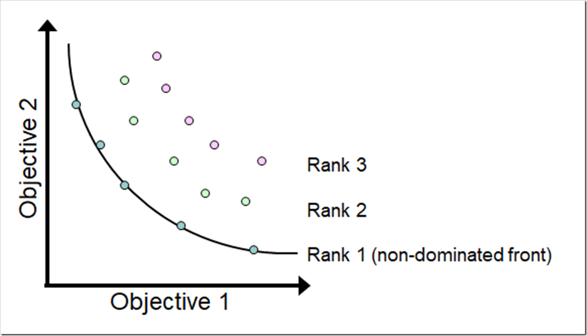
The goal of a multiobjective optimization is to push all of these solutions toward the non-dominated Pareto front, which is the ideal set of optimum solutions. Be aware that you cannot be sure – without knowing the Pareto front – that the final set of non-dominated solutions from a multiobjective algorithm reached the Pareto front. However, you can test if running for additional generations improves the set of solutions (i.e., moves closer to the Pareto front).
While it is possible to optimize for many objectives simultaneously, it becomes somewhat impractical to optimize for more than three objectives: a) as the number of objectives increase, the population size must increase exponentially and the number of generations must increase significantly (the computation time increases combinatorially as the number of objectives increase) and b) it is difficult to visualize the non-dominated fronts when you exceed three dimensions. The discussion in this post will be restricted to two objectives.
The Problem
In the Limits to Growth series, we explored the Bass diffusion model. The model is shown again below and can be downloaded here (with all the changes described in this post).
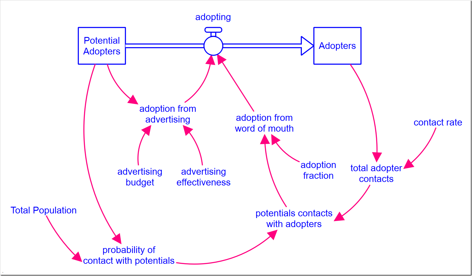
As you may recall, customers are converted by both advertising and word of mouth. In the closing post of that series, I discussed the importance of marketing spend to get the ball rolling. Specifically, without it, growth is very slow. Additionally, as more customers are converted, the word of mouth effect dominates how fast the product is adopted, making the marketing spend less and less effective. By effective, I specifically mean that it results in conversions. The graph below shows the two components of adopting and how the dominance shifts from marketing spend to word of mouth only six months after the product launch.
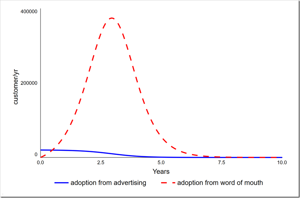
Note how the number of adoptions through advertising decreases over time. This suggest it is not necessary to continue advertising spend at the same level indefinitely. There is perhaps an optimal point where we could start to phase it out. [Warning: This scenario represents the adoption of a single durable good that is never replaced or updated. The situation is clearly different for both consumable goods and durable goods that are regularly replaced.]
If we are launching this unique product, say, the Pet Rock, we would be very interested to know whether we can increase our product lifetime profits by investing less in advertising. We can run an optimization that seeks to maximize conversions and minimize advertising spend over the life of the product.
Changes to the Model
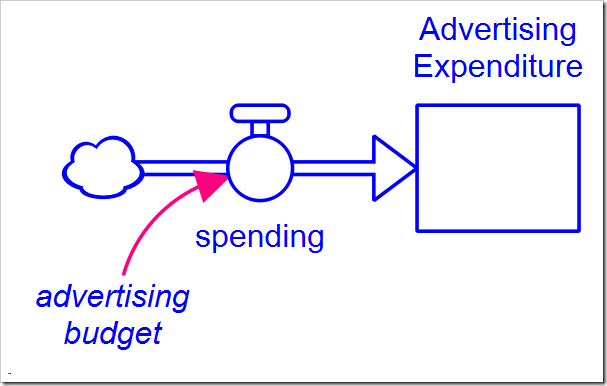
To minimize the total advertising spend, we will need to add a stock to the model that accumulates what has been spent (Advertising Expenditure is initialized to 0):
We also need to add structure to control the timing and rate of decrease in advertising spend. The variable advertising budget is expanded with the following structure:
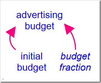
The value of initial budget is the same as the original value of advertising budget. The interesting part is budget fraction, which we want to decrease from one to zero as we decrease our spending. What shape should this drop off in spending take? I chose a linear shape. While many non-linear shapes could be modeled using a graphical function, the linear shape is easy to implement using the RAMP builtin function and approximates what we wish to capture. The equation for budget fraction is
1 – RAMP(decrease_rate, decrease_start_time)
+ RAMP(decrease_rate, decrease_start_time + 1/decrease_rate)
where decrease rate is the fractional decrease in budget per year and decrease start time is the time to start lowering the budget (it will not actually change until the following DT). Note the final term neutralizes the RAMP, thereby preventing budget fraction from becoming negative.
Optimization Setup
We want to minimize total cost, but how can we measure the rate of conversion? Luckily, Adopters tells us how many people have converted and Potential Adopters is its reflection, allowing us to minimize this (which maximizes Adopters). The only problem is that by the end of the simulation, almost everyone will have adopted, so there is not much differentiation between different values of Potential Adopters (or Adopters, for that matter). The solution is to look at Potential Adopters at an intermediate point when we know it is changing quickly. Looking at the above graph, the peak of adoption rate is around three years, which is also where both of these stocks are changing the fastest. We want the fewest remaining Potential Adopters at time three at the minimum cost.
To start, set up two different Payoff functions in the Payoff tab of the Model Analysis Tools tab (how to do this is described in part 1). Name the first one “Nonadopters” and add Potential Adopters to it. Leave the weight set at one. Set the Payoff time range to Specific time and enter the value 3. This will calculate the payoff at year three.
Name the second payoff “Cost” and add Advertising Expenditure to it. Leave the weight set at one and the Payoff time range set to Final value.
Move to the optimization tab and name this optimization “Minimize advertising cost.” Choose the following settings, leaving the remaining parameters at their default values:
- Optimization method: Differential Evolution (DE)
- Direction: minimize
- Generations: 30
- Population size: 20 [this is the default, but just make sure]
Also place a checkmark next to both payoffs, “Nonadopters” and “Cost.” Scroll down to the Optimization Parameters section to add the two parameters that will vary. First add:
- Variable: decrease rate
- Min value: 0
- Max value: 1
Then add:
- Variable: decrease start time
- Min value: 0
- Max value: 4
Update for version 1.6 and later: You can now also set the “Increment” when a parameter is only valid for discrete values separated by a fixed interval, as is the case with decrease start time. For a better set of results also set the Increment to DT:
- Increment: 0.0625
The first parameter range limits the slope of the decrease in advertising expenditure to one, i.e., at the fastest, the budget will be reduced to zero over a year. This is a reasonable roll-off as there are consequences to dropping out of sight too quickly that are not in this model. The second parameter range limits the latest time the decrease can begin to year four, which at a steepest slope of –1, would stop the expenditures at year five, well past where the above graph shows advertising not being effective. Be careful when you choose these values – including the setting of the payoff evaluation time to year three – as the model will behave differently than the base case as you change the parameters. In this case, some quick experiments with Stella Live™ shows these values are all within range (you can also use Sensitivity Analysis or run exploratory optimizations).
We will also need to set up a comparative scatterplot with Advertising Expenditure on the x-axis and Potential Adopters on the y-axis. Make sure to select the “Correlation plot (one point per series)” checkbox (the name is scheduled to change, so select whichever checkbox suggests displaying only one value vs. all values from the time series). Note that the value displayed will be the final value at the end of the simulation, but earlier values can be viewed by moving the time slider in the run toolbar.
Optimization Results
Running the optimization (by pressing O-Run) gives these results:
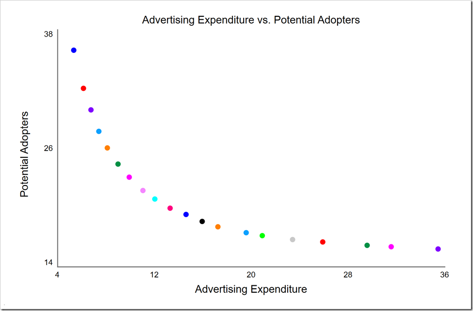
This is a clear non-dominated front with diminishing returns as we spend more past the knee (near the middle red dot). This allows us to make a choice of how much we wish to spend. Note that while we spent $100 million in the first simulation, the highest cost point on the non-dominated front (the rightmost purple point) is only $36 million while the knee is around $13 million. Because of the large savings, we may choose to move past the knee to the right, spending around $20 million.
Look carefully at the y-axis. These numbers are very low for the Potential Adopters at time three. This is because these are the final values at the end of the simulation, not the values at time three. If we desire the values at time 3, the quickest way is to drag the time slider in the run toolbar (at the bottom of the window) back to time 3:
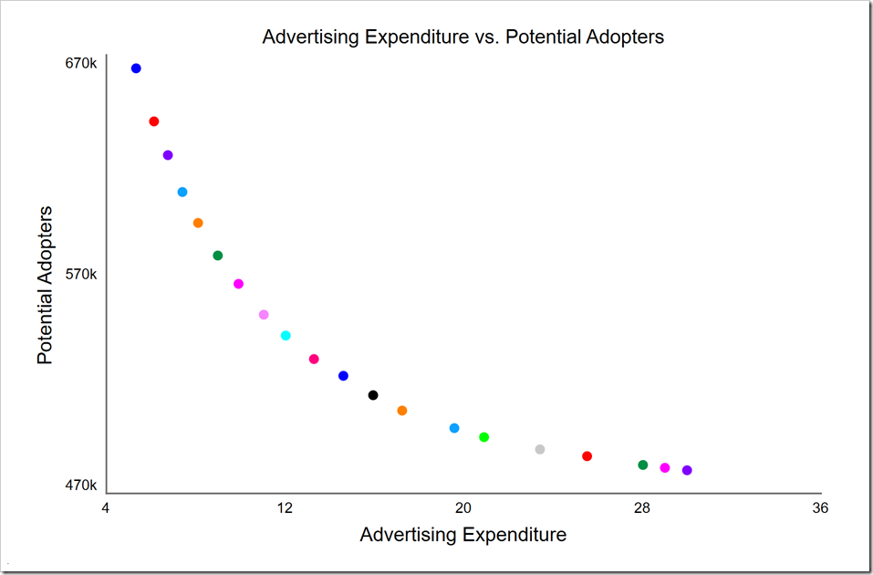
Potential Adopters is now within the expected range. Note by doing this, we are also viewing Advertising Expenditure at time 3. In this case, these values are almost the same as they were at the end of the simulation (excepting the rightmost three points), so it makes little difference. However, it will usually make a noticeable difference, so you will need to use the HISTORY function to isolate any given variable at a specific time that is not the end of the simulation. You could also use a comparative table or the table in the Results panel to get these earlier values.
The comparative scatter plot also gives the parameter values for each of these runs. Simply click the S button in the top-left corner of the comparative. This is the same button that gives parameters used for sensitivity analysis (hence the S). These can be exported to the clipboard if desired (by clicking the button). In this case, we get these values (I pulled the objective values in the last two columns out of the Results panel):
| decrease rate | decrease start time | Advertising Expenditure | Potential Adopters at 3 | |
| Run 1 | 0.999973 | 0.001760 | 5.33025 | 663908 |
| Run 2 | 0.667367 | 1.810161 | 25.90653 | 486984 |
| Run 3 | 0.742390 | 2.451710 | 31.56454 | 481691 |
| Run 4 | 0.711158 | 2.223419 | 29.57503 | 482983 |
| Run 5 | 0.995457 | 0.277064 | 8.10604 | 593390 |
| Run 6 | 0.999997 | 3.012684 | 35.43936 | 480565 |
| Run 7 | 0.998929 | 0.208633 | 7.40430 | 607494 |
| Run 8 | 0.999762 | 1.559691 | 20.91054 | 495667 |
| Run 9 | 0.890292 | 0.736507 | 13.29297 | 531296 |
| Run 10 | 0.899662 | 0.615946 | 12.03147 | 542009 |
| Run 11 | 0.942448 | 0.542896 | 11.04694 | 551521 |
| Run 12 | 0.851244 | 0.975785 | 15.94418 | 514800 |
| Run 13 | 0.999928 | 1.810161 | 23.41445 | 490090 |
| Run 14 | 0.762814 | 0.774353 | 14.61062 | 523648 |
| Run 15 | 0.980190 | 0.071659 | 6.13252 | 639705 |
| Run 16 | 0.929999 | 0.423085 | 9.91695 | 565598 |
| Run 17 | 0.970801 | 0.352890 | 8.98956 | 578522 |
| Run 18 | 0.999698 | 1.192909 | 17.24317 | 507784 |
| Run 19 | 0.942448 | 0.113589 | 6.75398 | 624309 |
| Run 20 | 0.892142 | 1.366294 | 19.58069 | 499792 |
We can see from this that Run 6 is the rightmost purple point and that Run 1 is the leftmost blue point, representing the two extremes. Note that both of these use the maximum slope, but the former decreases starting at time 3 while the latter decreases starting at the beginning. The knee is roughly at Run 9 (the middle red point). It is also clear that decrease start time is never greater than three, so limiting it to four was reasonable. Since decrease rate is sometimes close to one, its range could be expanded if that’s appropriate in a given market. Again, don’t make it too large. Consider how a manager would decide to reduce it and how fast it could be reduced without backlash from the market.
Alternate Metric
We minimized Potential Adopters as a proxy for how long it takes for customers to adopt our product. Would we get different results if we measured that time? To do this, we need to add the following structure:
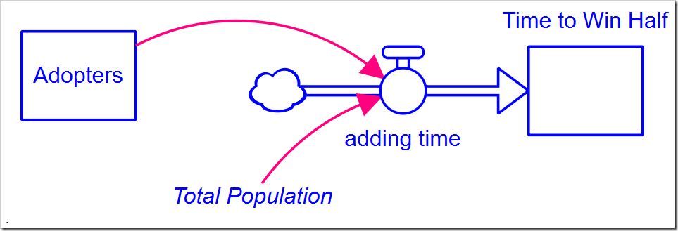 The equation for adding time is:
IF Adopters < 0.5*Total_Population THEN 1 ELSE 0
This counts, in Time to Win Half (which is initially zero), how much time passes before Adopters meets or exceeds 50% of the population. We can now add another payoff based on this stock, using all the defaults (name it “Market Dominance Time”). Also change the comparative scatter graph to have Time to Win Half on the vertical axis instead of Potential Adopters.
In the Optimization tab, uncheck the Nonadopters payoff and check the Market Dominance Time payoff. Press O-Run and you will find (from the log) that there are only nine non-dominated solutions. This may be sufficient for our purpose, but we chose a population size of 20 not just to provide enough diversity, but to also get a fair number of solutions evenly spread across the non-dominated front.
A common symptom that the optimization has not converged yet is getting fewer non-dominated points than the population size. We can double the number of generations to 60 to see if this makes any difference. It doesn’t; there are still only nine non-dominated solutions. The optimization has converged by 30 generations. Be careful, though: convergence is not just the number of non-dominated solutions. After 10 generations, there are also nine solutions, but it has not yet converged. The front is a bit ragged and, when we run more generations, we find it moves closer towards the origin. There is, however, not much change after 20 generations, so we probably don’t need to run for 30 (but we will continue to do so to be on the safe side).
Perhaps the parameters we chose for the DE algorithm (the defaults) are causing it to start exploiting solutions before it has fully explored the solution space. That is also possible, but is not the case here. So why then do we only get nine solutions?
This is very subtle and you have to be aware of it. The structure we added above counts time perfectly. Except our clock is not continuous, it is discrete. It steps by DT. This means there will only be one unique solution for every DT value. Any solution with a larger cost at the same DT value will be dominated, so will not appear. You have to consider this any time you use non-dominance with discrete values. The simple solution is to increase the number of integration steps so that time more closely approximates a continuous function. For example, DT is currently set to 1/16. If it is decreased to 1/32, there will be twice the number of time gradations, so we could expect 18 solutions:
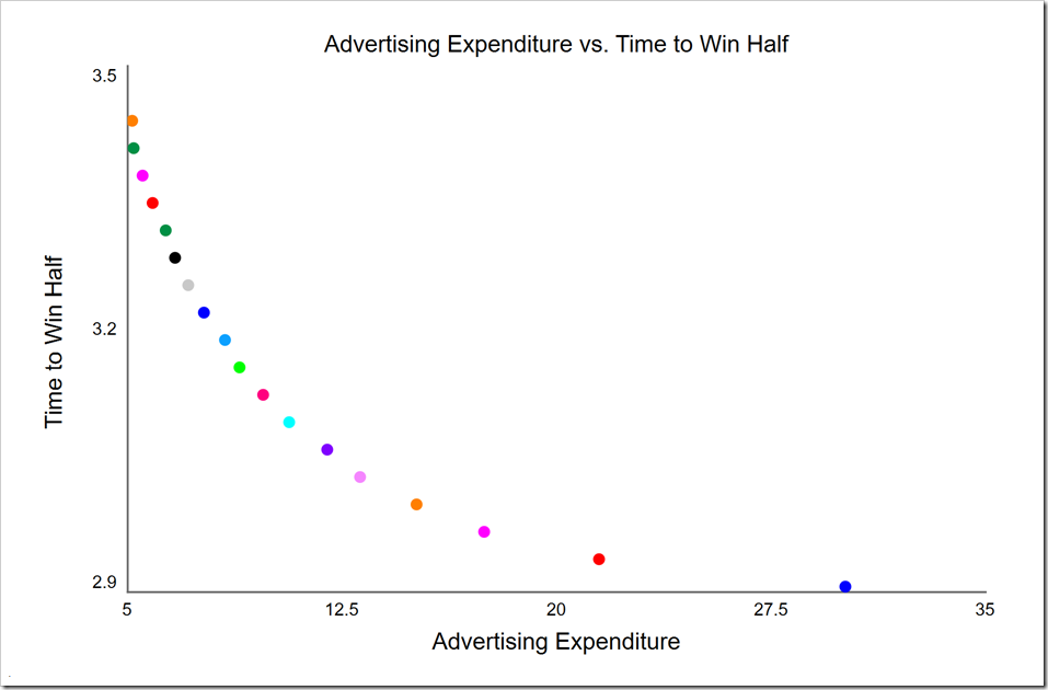
This may suit our purposes, but note how the density of points decreases as Advertising Expenditure increases. This is a clear symptom of not having enough resolution in our discrete parameter. If we decrease DT to 1/64, we will have four times the number of time values to work with, giving both 20 solutions and a much better distributed front:
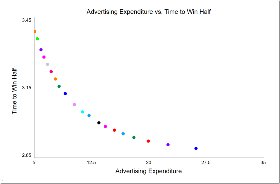 There is still a certain jaggedness to the curve, but it is much better. Note the highest cost point (on the far right) is less costly than when DT was 1/32. The knee here, in light blue at around $12 million, is also lower (in cost) than it was when we used Potential Adopters. With this metric, we are directly measuring how long it takes us to become the dominant player in the market. If we have intelligence about a competitor trying to offer a similar product, we may strategically decide to spend more to achieve dominance before they get off the ground, thus ensuring our success.
Competition
We have assumed so far that we are the sole suppliers of this product and there are no competitors. What if someone else is working on a similar product or wishes to copycat ours? How does that change the results?
To model this, we need to create a second copy of the entire model structure except Potential Adopters (now called Potential Customers), which is necessarily shared between the two competitors (the model can be downloaded here):
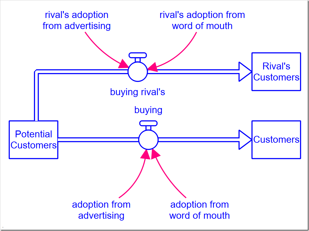
All of the parameters are the same for both companies (including advertising budget and advertising effectiveness) and they enter the market at the same time. Given this, what would you expect to happen in the end?
If you guessed that they both end up with 50% of the Potential Customers, you would be correct. In this situation, with all of the parameters the same for both, can we find a minimum total advertising spend that improves our market position? This is not likely, as the other company is just as effective as we are. Even so, we may be able to save quite a bit of money over the life of this product.
The optimization setup is almost identical to the no-competitor case. We have a clear metric to maximize, either the number of adopters or the market share at the end of the simulation. Create a new payoff called “Adopters”, add Customers to it. Set its weight to –1 as we want to maximize it (and we are set to minimize Cost). Change the optimization to use Cost and Adopters for the payoffs and press O-Run. You should see the following:
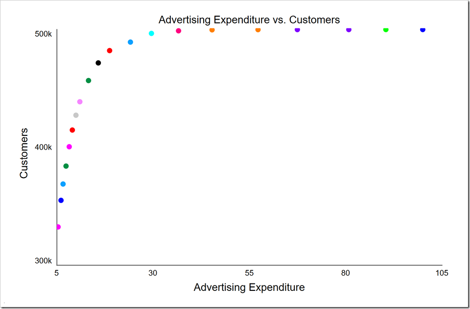
Note we cannot gain more than half the potential customers as our competitor is doing the same thing we are doing. In fact, if we spend too little, we give the advantage to our competitor. For example, when we gain 400K customers, they gain 600K. We actually gave those extra customers to them by spending too little.
We still have the opportunity to save money. There are many points at the top of the graph that all give us virtually half of the customers, starting with the rightmost red point that yields 499K customers from a total spend of $36.6 million (vs. $100 million at the far right). The very next point to the right (orange) wins us just 270 shy of 500K customers from a total spend of $45.3 million. The very next point to the right only gains us 160 customers for $12 million more, clearly showing diminishing returns. In fact, the cyan point to the left of the red one yields 497K customers for $29.6 million, $7 million (and 19%) less than the red point. If this is a one-time product, we may want to move further to the left and save more over that product’s life.
Incidentally, the three points around the red one all have a decrease rate of 1. They differ only in the start time for the decrease: cyan: 2.42, red: 3.13, and orange: 4.0. Note that the start time is also discrete as it must be a multiple of DT, so those that are not exact multiples will shift to the nearest DT. Specifically, 2.42 will shift to 2.4375 and 3.13 will shift to 3.1875. You can reduce these shifts by decreasing DT – as long as you don’t lower it so far you introduce integration artifacts. There is a mechanism within the DE algorithm to only test and report [uniformly-spaced] discrete values, but that is not yet exposed to the user interface (stay tuned) so we need to keep this in mind. [Update for version 1.6 and later: This is now available in the optional Increment setting for each parameter.]
We started with the idea that we may have to compete with a copycat or someone who is close to releasing a similar product. This means that, while they may have the same effectiveness as we do, they won’t start advertising and selling when we do. To test the impact of someone entering the market after us, we need to expand the rival’s advertising budget structure:
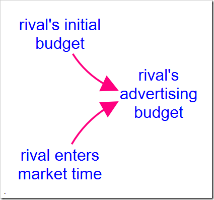
The equation for rival’s advertising budget then becomes:
STEP(rival’s_initial_budget, rival_enters_market_time)
When rival enters market time is zero, we both enter the market at the same time, as above. But what if they enter the market six months after we do? Set this variable to 0.5 (six months is half a year) and press O-Run:
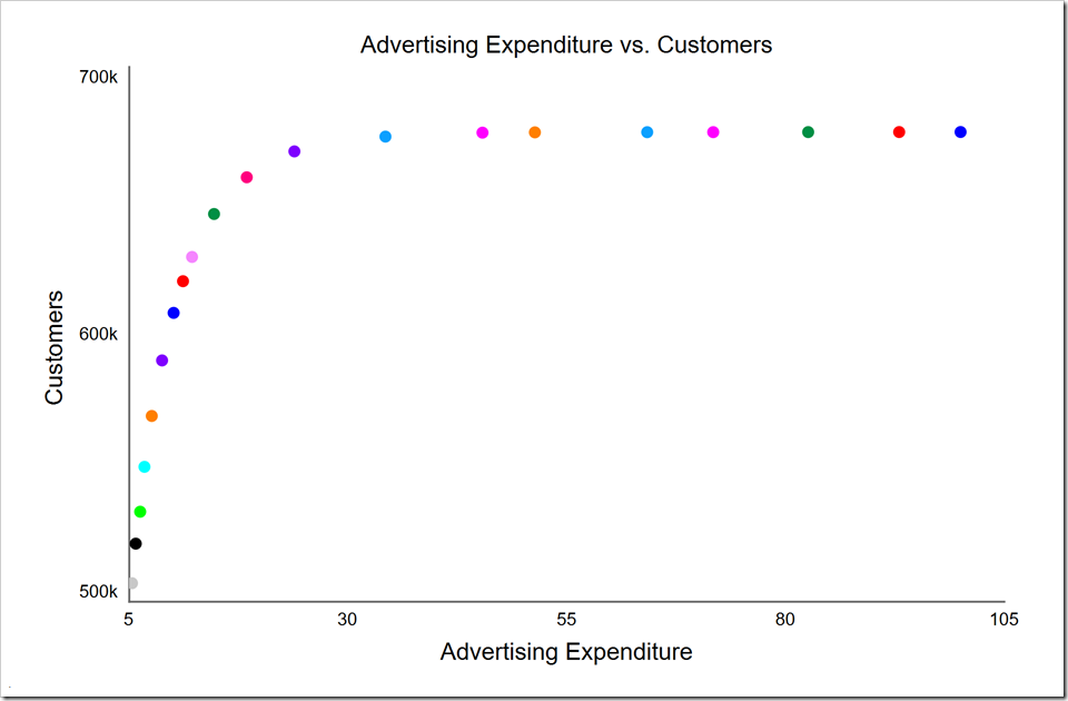
It is pretty clear from this that we are wasting our money beyond the light blue point at $34.3 million where we’ve already reached 674K of the potential maximum 676K customer we can win. While the purple point to its left wins us 8K fewer customers, it saves us $10.4 million. Continuing to move to the left, the red point to the purple’s left wins us 9K fewer customers for $5.5 million less. The green point to the red’s left, which is the knee, gains us 14K fewer customers, but saves us $5.5 million. You can again see how we achieve diminishing returns above the knee. The following table summarizes these solutions and the percent change from the solution immediately above it in the table.
| decrease rate | decrease start time | Advertising Expenditure | Customers | change in spend | change in cust | cost per customer | |
| green | 1.000 | 0.938 | 14.7M | 645K | |||
| red | 0.999 | 1.31 | 18.4M | 659K | 25% | 2.2% | $264 |
| purple | 0.999 | 1.85 | 23.9M | 668K | 30% | 1.4% | $611 |
| lt blue | 0.572 | 2.52 | 34.3M | 674K | 44% | 0.9% | $1733 |
By moving from the green point up to the red point, we gain 2.2% more customers by spending 25% more. Is it worth it? We cannot judge that without additional information. For example, strategically, we may wish to win the highest market share possible with this product because it paves the way for other products or services. Or our return from gaining an additional customer may outweigh the additional cost above the knee. While it costs us, on average, $264 of advertising spend to gain a customer between the green and the red points, we may still make a profit of, say, $100 per sale after this expense. That adds up to $1.4 million of additional profit over the product’s life, money we would otherwise give away to our competitor. Note that this $100 profit per customer would become a $511 loss per customer were we to move from the red point up to the purple point. While normally we would not wish to do this, we may still decide to invest in these additional customers if that market share were strategically important. We may also decide to do so to maintain brand awareness in the market.
If we had performed a single-objective optimization with weights assigned to each payoff, we would not have learned so much and would have had to accept a single “optimal” value. I hope this quick introduction to multiobjective optimization will get you started in exploring ranges of optimal solutions that allow tradeoffs to be explored.